 |
| тыцабельно, кортинко на самом деле большой |
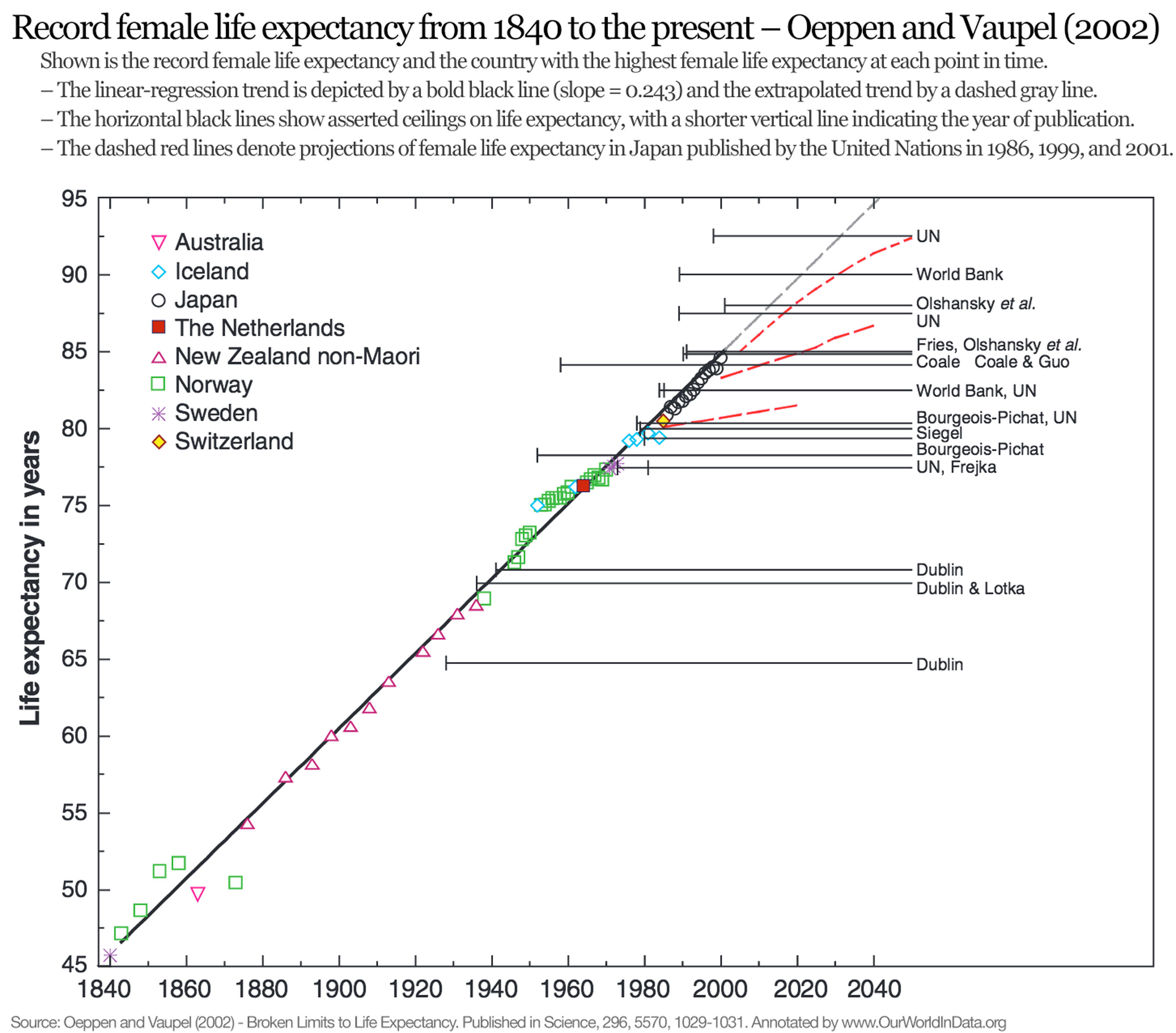
The following graph is taken from the paper ‘
Broken Limits to Life Expectancy‘ published in Science by Oeppen and Vaupel in 2002.
4 It shows quite a lot of information:
- The colored symbols represent the highest life expectancy of women from 1840 to today – indicating that country with the highest life expectancy at each point in time. For instance, we can see that in the mid-1800s, Norway had the highest life expectancy, but then by 1880 people in non-Maori New Zealand were expected to live the longest lives. The data shows that in the life expectancy in the leading country of the world has increased by three months every single year.
- The solid horizontal line represents the results of the linear regression on all these points; remarkably, the maximum life expectancy seems to follow this linear trend very closely. The gray dashed line is the extension of this trend into the future, and the red dashed lines represent ‘projections of female life expectancy in Japan published by the UN in 1986, 1999, and 2001.’
- The author names listed on the right refer to multiple predictions of the maximum possible life expectancy for humans. The horizontal black lines extending from the publication denote the prediction in each publication of the asserted ceiling on life expectancy attainable by humans and the year in which the study was published. Dublin published a study in 1928 that asserted that the maximum life expectancy possible was less than 65 while at the same time life expectancy in New Zealand was already over 65. The predictions of maximum life expectancy were proven wrong again and again over the course of the last century. On average the predictions have been broken within 5 years after publication.

No comments:
Post a Comment